Worked across functions and with leadership to create and roll out a new visual identity system for Gap Inc.
You’d notice if 21 percent of your outfit was missing. What if you learned 21 percent of your paycheck is missing?
To highlight Gap Inc. as a leader in Equal Pay, we created #CloseThePayGap — an interactive digital experience that aimed to educate and empower millennial women to take a stance on equal pay.
The visually led campaign featured images of Gap Inc. employees missing 21 percent of their outfits, designed to convey strength (positioning Gap Inc. as an ally and a resource), highlight both female and male employees from across Gap Inc. brands, and feel authentic to the fashion brand.
I worked with Gap Inc.’s content team to conceptualize, recruit models, organize and art direct the photo shoot — including altering the denim jackets and otherwise removing about 21 percent of each employee model's outfit. I also did all photo editing and post-production work for the images.
At the shoot, we also took the opportunity to film video of employees interacting with their outfits (and the missing 21 percent of fabric), which we turned into an engaging 15-second video. This ended up being our highest-performing asset on social media.
All original content (plus other relevant content that we resurfaced) appeared on an equal pay-themed landing page — a resource for visitors to learn more about the wage gap, and for female visitors to calculate how much they could potentially lose via an interactive calculator.
Worked directly with VPs and above to develop a logo for Aro — Gap Inc.’s new Center of Excellence for Global Innovation + Performance.
With an emphasis on performance capabilities (in both activewear and ready-to-wear), I wanted Aro’s logo to feel active, and also to reflect its name, so that it wouldn’t feel out of place if the logo appeared without the “Aro” text.
I came up with a few different logo options, but both the head of Aro and the head of Athleta gravitated toward the semi-transparent sideways arrow.
Since we wanted to emphasize that Aro is a part of Gap Inc., we felt it important to align to the Gap Inc. aesthetic as closely as possible. Therefore, colors and fonts were borrowed directly from Gap Inc.’s 2016 Style Guide.
Aside from the logo itself, the biggest deviation from Gap Inc.’s aesthetic is in Aro’s image guidelines.
Through photography, my first thought was to showcase active teams —emphasizing teamwork and collaboration across Gap Inc. brands, as professed in Aro’s mission statement. But after talking with Tetsuya O’Hara (head of Aro), he wanted the photography to emphasize the quality and performance of the fabrics — leading me to focus on detail shots of clothing being worn outdoors, by people in action.
Find the final Aro Style Guide, plus working iterations of the logo development and photography mood boarding, to the right.
Design is in the details. And it takes obsession with detail to breathe life into that irresistible piece of clothing. These are the people behind the scenes at Gap Inc. — the dedicated professionals who push themselves every day to create clothing that resonates. Get to know these heroes of their craft.
CONTENT SERIES
My Gap Inc. content marketing team came up with the Craft Heroes series to meet a variety of goals at the Gap Inc. level:
1. Reinforce desired employee behaviors (experimentation, attention to detail, customer obsession, innovation, etc.) through example; reward high-performing employees by investing in their stories.
2. Attract new talent; highlight Gap Inc. as a fun and creative place to work.
3. Reinforce craftsmanship and quality with consumers and investors; customers feel a personal connection with the brand by getting to know the people behind the scenes.
BRANDING DESIGN
Wanting to channel the quality of a finished product, we settled on a clean linear design reminiscent of a clothing tag.
The white design is meant to be placed over detail images of fabric and/or craftsmanship — allowing our product development photography to shine through, keeping the visual focus on clothing and/or talent.
The design is meant to accompany written and/or photo stories with a header image; for video, the logo is meant to be a part of the video still. I also created an animation, in partnership with my videographer, to introduce the logo at the start of each Craft Hero video.
Find Craft Heroes stories and videos on Gap Inc.’s aDressed blog.
I was delighted to work with Hit Factory podcast creators Carlee Gomes and Aaron Casias to develop a look and feel for their podcast about the films and politics of the 1990s.
Listen on Patreon, Spotify, or Apple Podcasts.
The goal for 2017’s Equal Pay Day campaign was to create a unified message across Gap Inc. brands, with each brand participating in some sort of equal pay message on their respective social media channels. Gap Inc.’s Foundation team — which owned campaign messaging this year — was inspired by a product laydown image of sweaters linking arms (below right), which they pitched to all brand marketing teams.
For my Gap Inc. Content Marketing and Creative team, our challenge was to translate that product angle to work with our @GapInc. corporate identity. I came up with the idea to do an employee “laydown” image to tie into the brands’ direction, while also highlighting the people behind the business.
We invited employees from Business Resource Groups to be a part of the photo — emphasizing support, inclusion and equality — to showcase how Gap Inc. stands for and celebrates equality leading into Equal Pay Day.
In addition to shooting the laydown photo, we took the opportunity to film a short 15-second video of male and female employees linking arms in solidarity, which we titled “Stand Together” — referencing how women and men are allies in the fight for equal pay, and also how Gap Inc. is taking a united stance across its brands.
We also partnered with the Photo Studio team to create a stop-motion video of the laydown, and our social media manager took the opportunity to experiment with filming a Facebook Live video of our shoot “behind the scenes,” which performed exceptionally well.
Fabric is the first step in clothing design, and can often be the inspiration for clothing designs themselves — especially when new fabric technologies and material treatments are involved.
While my Gap Inc. content team had been focusing on product development storytelling — emphasizing collaboration across multifunctional teams and also the vendors who make our clothing — we decided to take a step back in the process and focus on the development of the materials used to make clothing, and how their development influences the entire product process.
We worked with Gap Inc.'s Global Supply Chain team to identify a strong brand story that would emphasize their team's work, as well as be a strong product story for the brand.
We landed on Banana Republic's partnership with famed Scottish mill Todd & Duncan, which is not only renowned for their history of producing the world's finest cashmere, but also their investment in new processes and technologies (such as machine-washable cashmere).
I traveled to Todd & Duncan's Scottish mill, and directed a locally sourced photographer and videographer through the factory over two days — capturing imagery and video that would be used to support product storytelling for Banana Republic, mill storytelling for the Global Supply Chain team, and behind-the-scenes development storytelling for my Gap Inc. team.
While there, I interviewed a few of the people who work in different areas of the mill on-camera for a series of videos (some external, some internal-only) and wrote a story.
The content was used externally by our @GapInc handle, as well as by the Banana Republic social media team and on the e-commerce site, BananaRepublic.com, on a landing page dedicated to Holiday sweaters.
To support a major Gap Inc. initiative encouraging teams to work collaboratively across departments and functions, I embedded myself with the Banana Republic design, merchandising, tech design and production teams as they traveled to Hong Kong to review early clothing samples and co-create with vendors.
It was important to show how team members from different functions worked together in one room to create something beautiful and unique with customers in mind — often re-shaping garments on-model, or in some cases coming up with something completely new in response to a new fabric technology shared by vendors.
I shadowed the team for one full week, also directing a local photographer and videographer to capture imagery that we could use in both internal and external storytelling (once product hit stores).
I created an internal series of stories and an internal video, which we then shortened and re-cut for external use once the featured product hit stores. See how this content strategy came to life externally:
- Sketch to Store: Banana Republic, Summer 2016 (attended) + Video recap
- Sketch to Store: Banana Republic + Gap, Winter 2016 (written in absentia, based on the first trip, but featuring new photos of new product)
_________________
While in Hong Kong, I also wrote stories and captured photos for two other content series — opportunistically using my time and location to create as much content as possible, while also being able to showcase Gap Inc. as a global company.
As a part of my design work for Goodreads, I was asked to spend a limited amount of time creating visual branding for co-founder and editor-in-chief Elizabeth Khuri Chandler’s new podcast, “Books of Your Life with Elizabeth.”
To kick off my portion of the project, I first met with Elizabeth to learn about her vision for the podcast, the different platforms we would need to design for, and about her stylistic preferences and personal aesthetic. She wanted something fun, optimistic and a little geeky, that also wasn’t afraid to be feminine.
Building off of that direction, and also reviewing other successful podcast art that tends to feature large titles with bold colors, I put together five rough concepts that we reviewed alongside two other members of her Goodreads editorial team.
We ultimately agreed on my first concept, featuring Elizabeth’s signature cat-eye glasses paired with a script font, on top of a bold, optimistic yellow that also works nicely with Goodreads’ color palette. A book-chevron pattern could also be incorporated for additional geekiness.
For Elizabeth’s profile photo, I found inspiration from an image showcasing a woman holding a stylized set of books. This in turn inspired Elizabeth to order a new set of Jane Austen books (one of her favorite authors) for a similar photo.
We used Elizabeth’s new photo on her Goodreads group profile page, as planned, but we also decided to use it alongside photos of her podcast guests to promote individual episodes.
See the final branding elements, plus rough original mocks, at right.
Partnered with a videographer to conceptualize, produce and direct various videos for Gap Inc.’s Content Marketing and Creative team.
An assortment of layout designs for the SF Bay Guardian and the San Francisco Examiner.
Highlights include a board game-themed events calendar for the SF Examiner’s summer arts supplement; a feature on the Identity Project for the SFBG’s Queer Issue; plus creative layouts and infographics for arts pages.
Also included are a pair of two-page features:
1) A Fleet Week cover story feature for the SF Examiner, which was featured in the seventh edition of “The Newspaper Designer’s Handbook” as an example of good design.
2) SFBG cover feature on 10 things San Francisco should fund, and 10 it shouldn’t: Red and black arrows symbolize programs that were in the red (a.k.a. underfunded, neglected needs) and programs that were too far in the black (a.k.a. misplaced budget priorities).
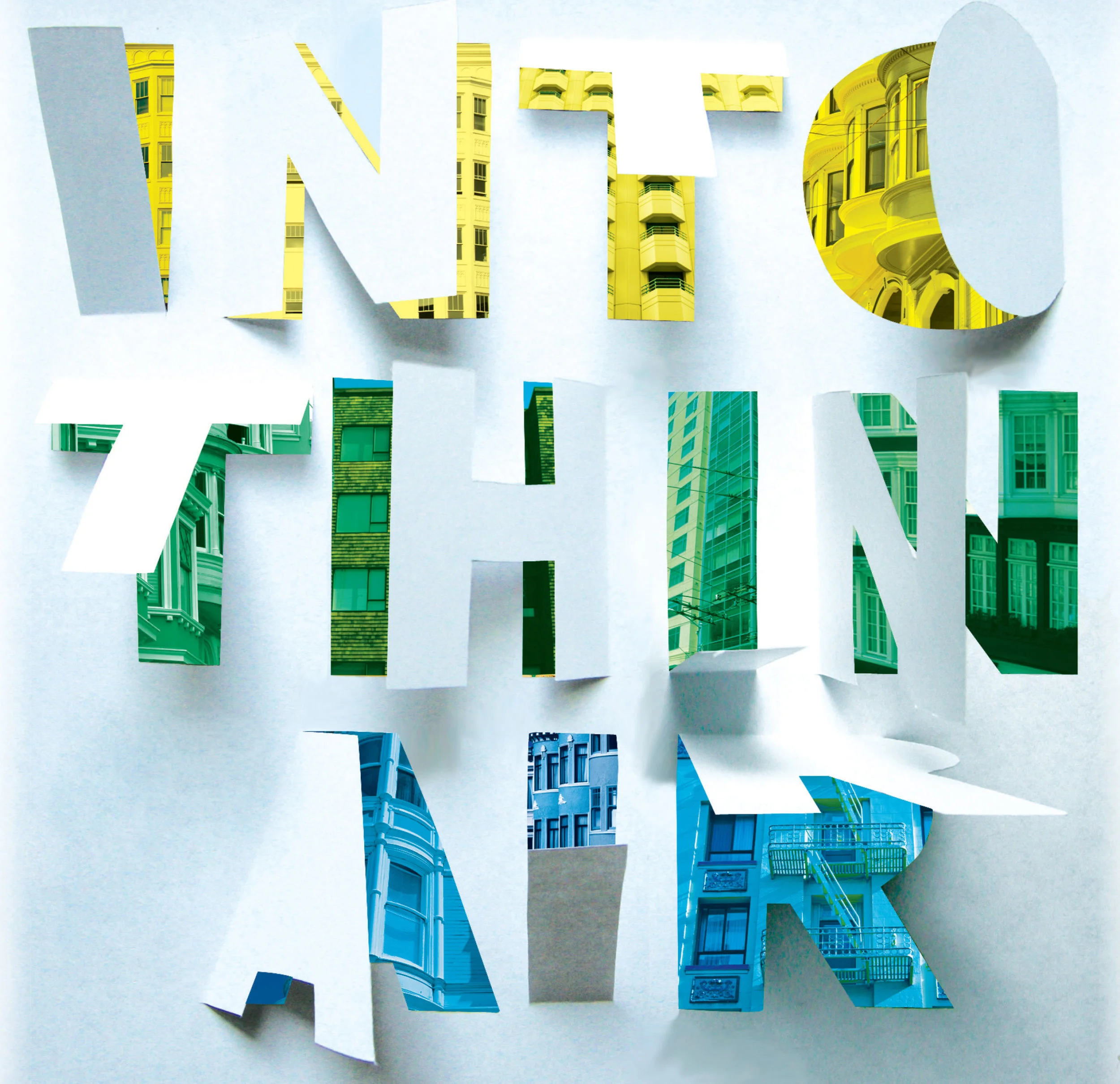
I’m obsessed with 3D typography.
I created “Into Thin Air” for an SF Bay Guardian cover about Airbnb’s effect on housing in San Francisco — using thick paper and an X-Acto knife to cut out the letters before adding the colorful background buildings and otherwise refining the design in Photoshop.
For “Work vs. Wealth” I used objects to form the letters in “work,” and then photographed the letters individually. (I found the crumpled money lettering via iStock.)
I created the “craft” lettering as a branding experiment for Gap Inc.’s Craft Herores content series. I used an X-Acto knife to cut letters out of denim samples (in Gap Inc.’s former font). I then teased the edges with a razor, and put a few pieces through the dryer before photographing them together.
Provided art direction on this Cindy Sherman-themed photo feature, in which prominent San Francisco drag artists Fauxnique, Lady Bear, Boy Child and Lil Miss Hot Mess re-created Sherman’s untitled photographs (#351, #354, #355, #360) from 2000.
This SF Bay Guardian feature was covered by Lomography Magazine, BuzzFeed and other outlets.
Photography and lighting perfection by Michael Keeney and Jasmine Law.
Produced and directed two graphic features for the San Francisco Bay Guardian, working with illustrator Sean Morgan.
I met Morgan at a CCA Illustration Thesis Review, where I was blown away by his black-and-white work ... and the fact that I was searching for someone with exactly his talent to illustrate the SFBG’s Candidate X issue — the fictional saga of a political superhero’s emergence in San Francisco.
The black-and-white Candidate X was a success, and as soon as I heard the words “political graphic novel” in a planning meeting for the SFBG’s annual Freedom of Information issue, I knew Morgan would again be a perfect choice to illustrate the two-page feature on the life and work of Internet activist and icon Aaron Swartz.
I was really excited to work with him again — this time in color — and create something relevant, interesting, and an example of how much of an impact we can have when we think outside the box of traditional storytelling.
Conceptualized and styled this updated version of The Rolling Stones’ “Let it Bleed” album cover for the SF Bay Guardian’s Music + Food issue.
The shoot itself was chaotic yet creative, with photographer Matthew Reamer and myself troubleshooting in real time at his Mission studio to make sure we had the right setup with the right props to best reflect a modern, San Francisco-focused version of the iconic album cover.
The creative energy and on-the-spot design and construction was so inspiring, this is one of my favorite shoots to-date.
Conceptualized the SF Bay Guardian’s 2013 Best of the Bay Issue theme “Sounds of the City,” and worked with artist Robert Liu-Trujillo to create an illustrated cover and four full-page illustrations to accompany each of the issue’s sections: Food + Drink; Shopping; Music + Nightlife; City Life.
Aside from daily doses of San Francisco sounds, I also drew creative visual inspiration from the opening of the animated series “Hey Arnold!” (bottom right).
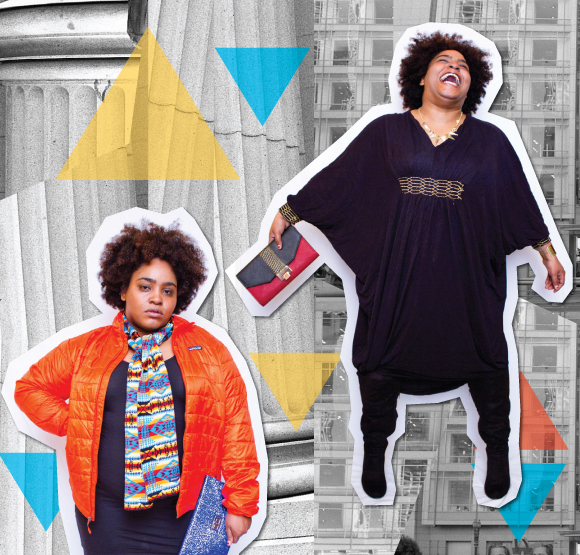
Art directed this fashion photo shoot, in addition to creating the collage-style layout.
Fashion photography by Cabure Bonugli (a.k.a. Shot in the City); San Francisco photography by Reynaldo Cayetano Jr.