


Worked directly with VPs and above to develop a logo for Aro — Gap Inc.’s new Center of Excellence for Global Innovation + Performance.
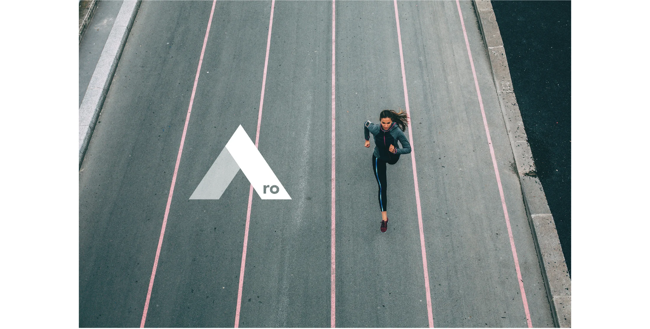
With an emphasis on performance capabilities (in both activewear and ready-to-wear), I wanted Aro’s logo to feel active, and also to reflect its name, so that it wouldn’t feel out of place if the logo appeared without the “Aro” text.
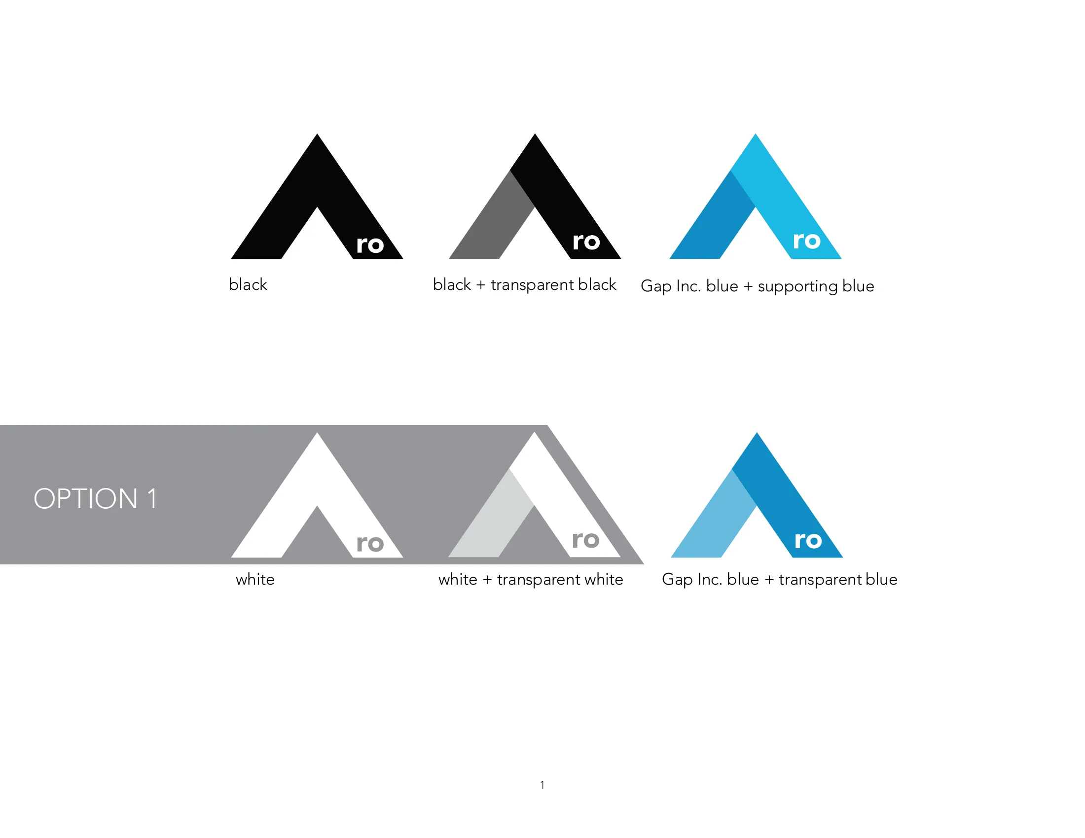
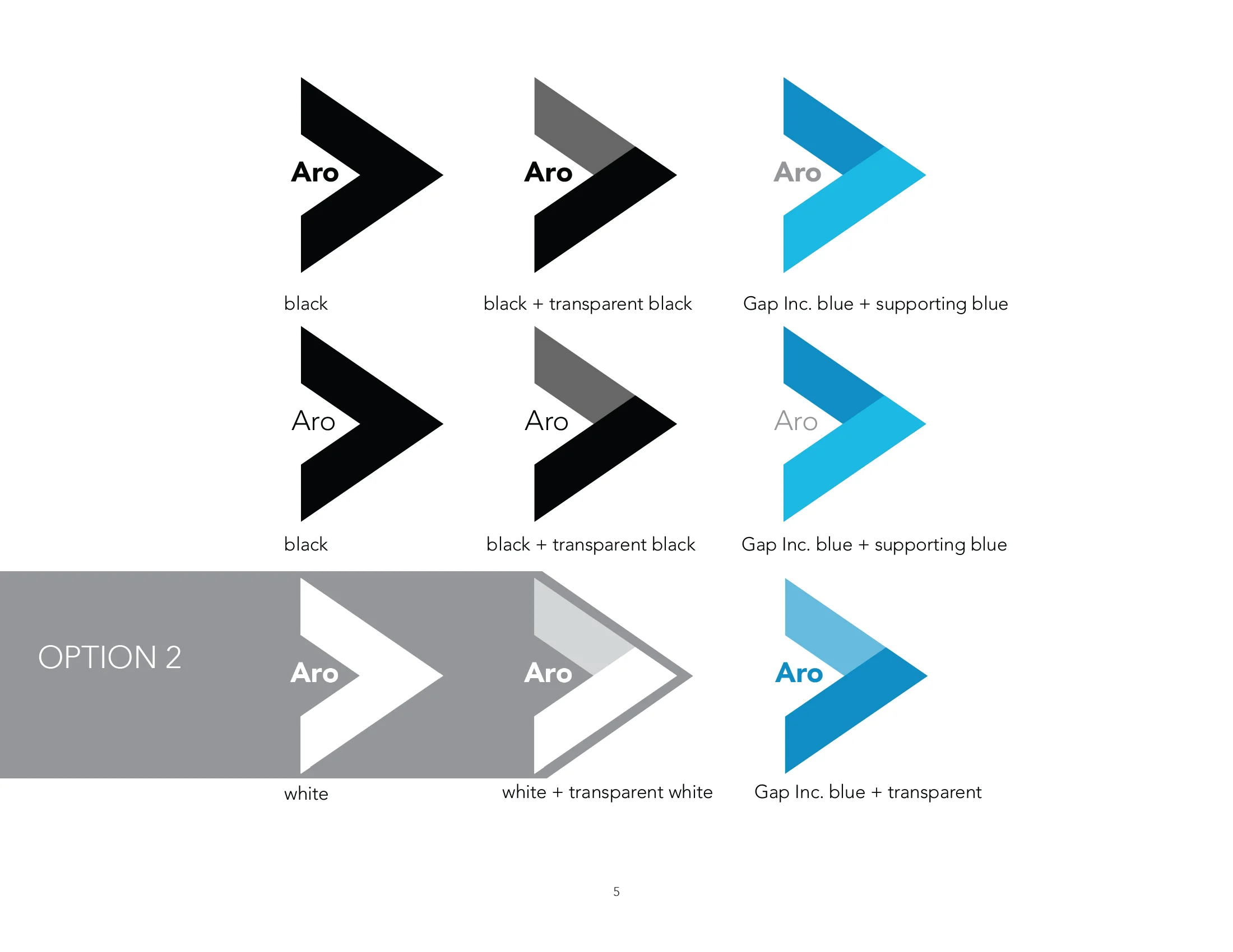
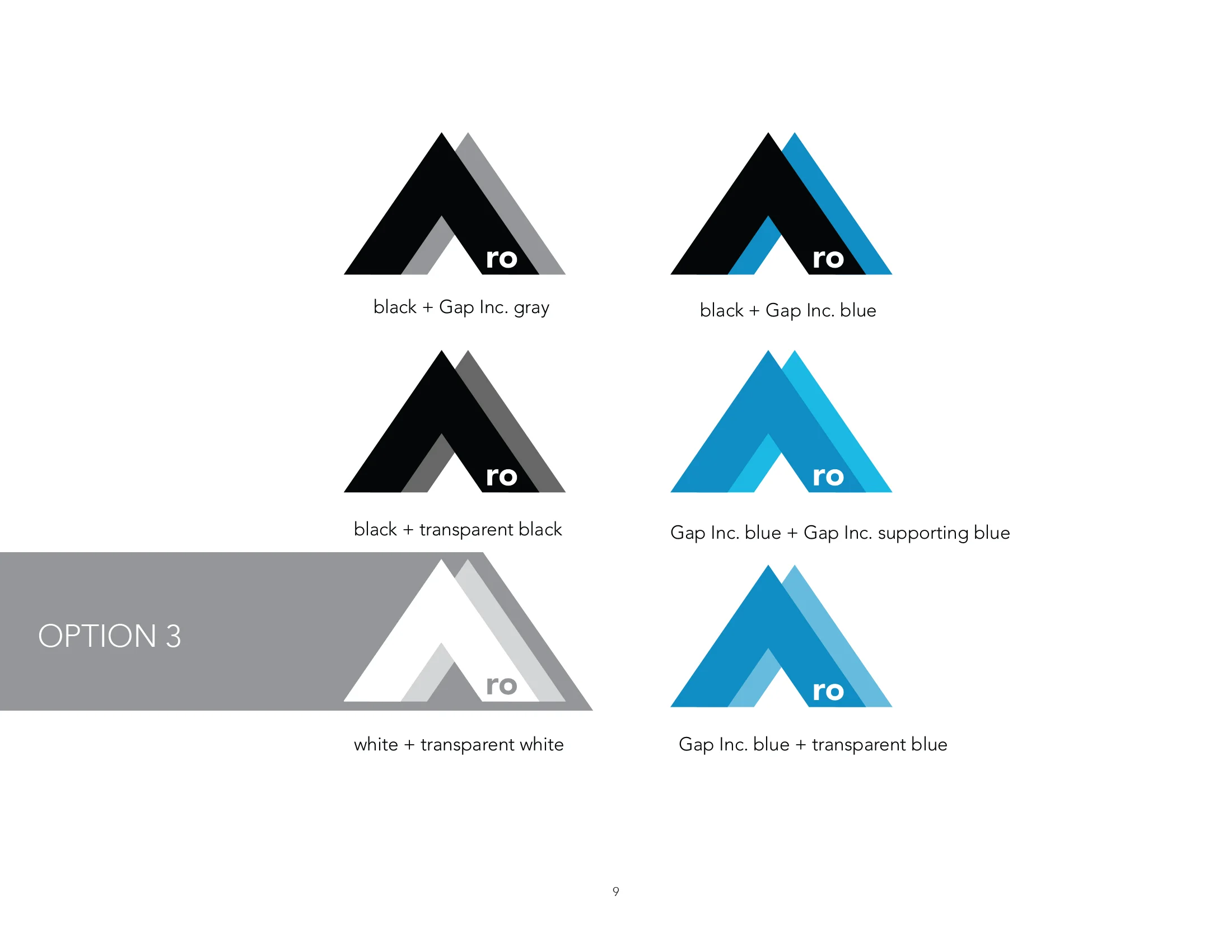
I came up with a few different logo options, but both the head of Aro and the head of Athleta gravitated toward the semi-transparent sideways arrow.
Since we wanted to emphasize that Aro is a part of Gap Inc., we felt it important to align to the Gap Inc. aesthetic as closely as possible. Therefore, colors and fonts were borrowed directly from Gap Inc.’s 2016 Style Guide.
Aside from the logo itself, the biggest deviation from Gap Inc.’s aesthetic is in Aro’s image guidelines.
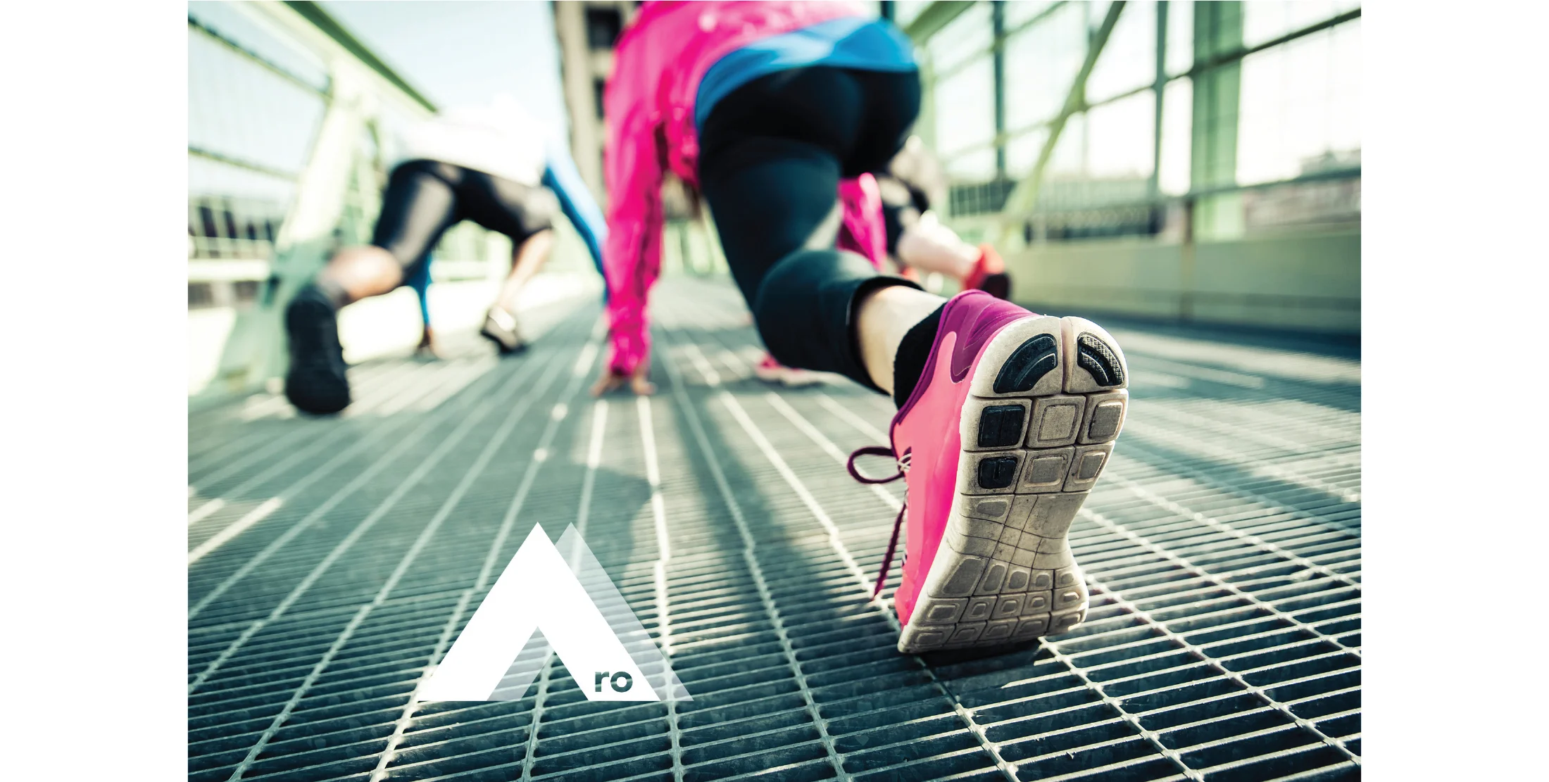
Through photography, my first thought was to showcase active teams —emphasizing teamwork and collaboration across Gap Inc. brands, as professed in Aro’s mission statement. But after talking with Tetsuya O’Hara (head of Aro), he wanted the photography to emphasize the quality and performance of the fabrics — leading me to focus on detail shots of clothing being worn outdoors, by people in action.
Find the final Aro Style Guide, plus working iterations of the logo development and photography mood boarding, to the right.