

I’m obsessed with 3D typography.
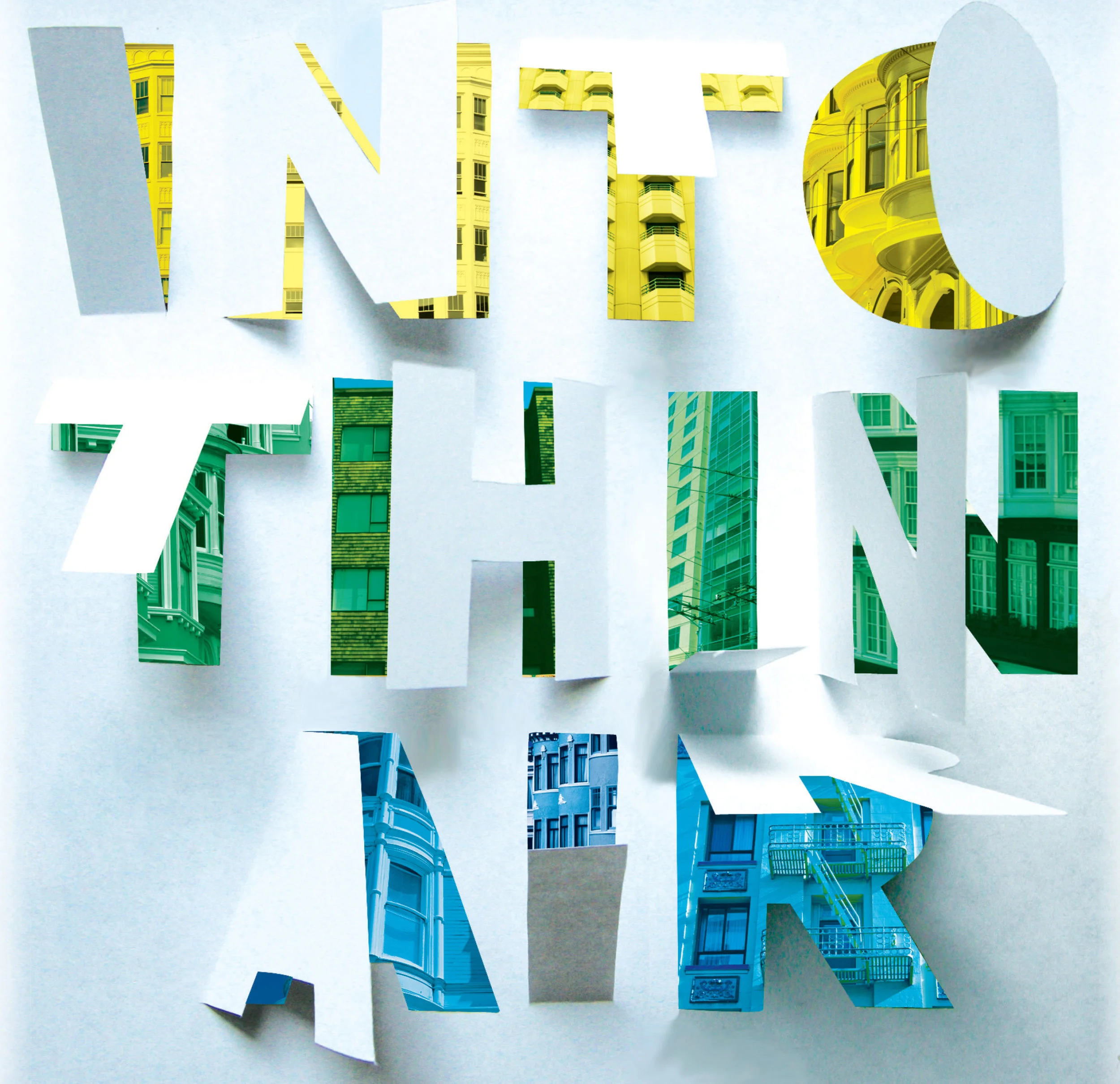
I created “Into Thin Air” for an SF Bay Guardian cover about Airbnb’s effect on housing in San Francisco — using thick paper and an X-Acto knife to cut out the letters before adding the colorful background buildings and otherwise refining the design in Photoshop.
For “Work vs. Wealth” I used objects to form the letters in “work,” and then photographed the letters individually. (I found the crumpled money lettering via iStock.)
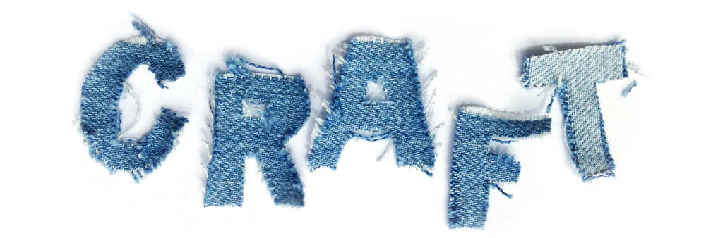
I created the “craft” lettering as a branding experiment for Gap Inc.’s Craft Herores content series. I used an X-Acto knife to cut letters out of denim samples (in Gap Inc.’s former font). I then teased the edges with a razor, and put a few pieces through the dryer before photographing them together.