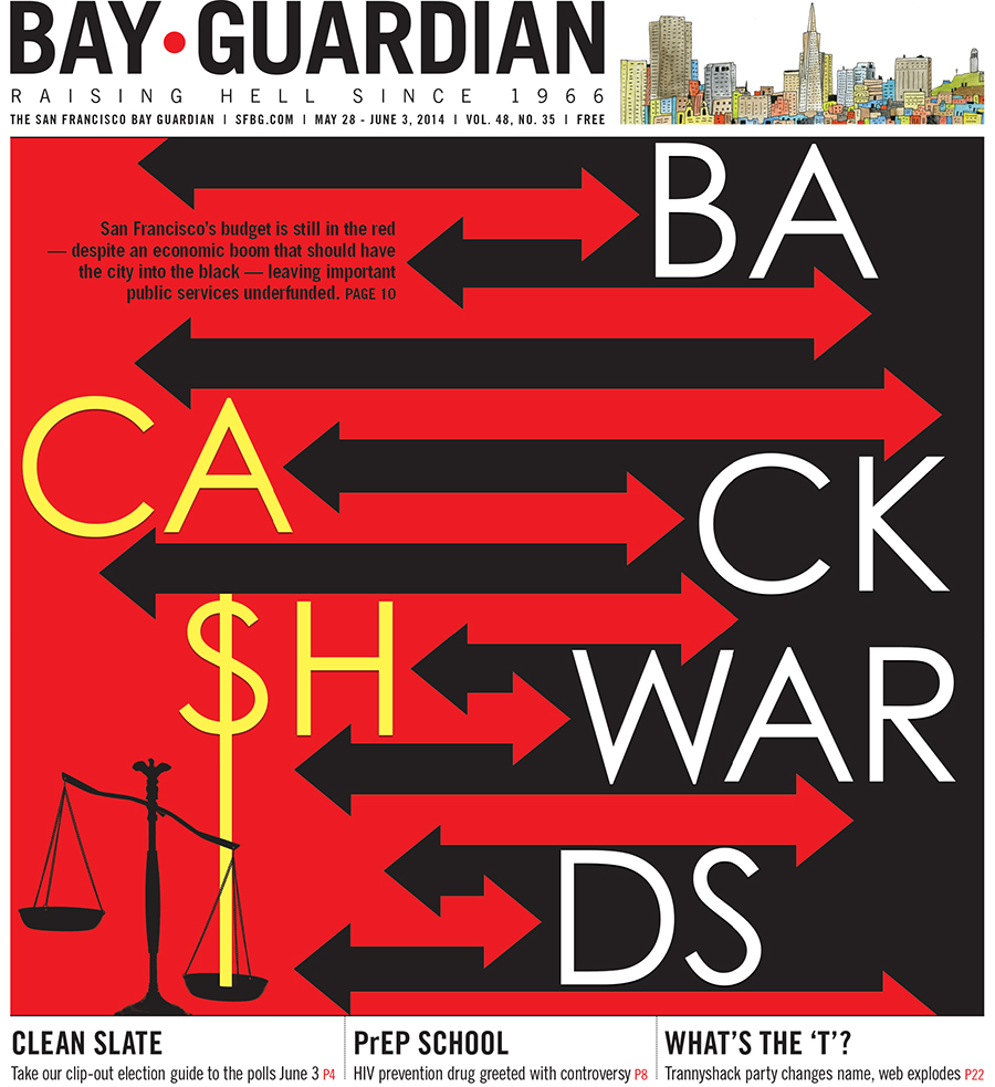
This story concept — 10 things SF should fund, and 10 it shouldn't — lent itself well to an infographic.
I used red and black arrows to symbolize programs that were in the red (a.k.a. underfunded, neglected needs) and programs that were too far in the black (a.k.a. misplaced budget priorities).
Images were adjusted to be either black-and-white or red-and-white to help separate the different sides, strengthening the overall concept.
For a larger version of the graphic, click here and flip to pages 10-11.

I took the red and black arrows from the above graphic and used them to create a pattern that interacts with the headline on the cover, below. My editor originally had an idea to use scales on the cover, so I wanted to incorporate that somehow in my arrows design. I ended up replacing the "s" in "cash" with a dollar sign, and using that to tip a smaller set of scales. Compromise!